A Mini Brochure
So I was needing to update my promotional materials and I thought this would be a good time to use a really cool technique to Create a mini brochure Business Card size.
Let's go thru the process.
Personally I'm an instant gratification type of girl and I like to be able to print my stuff myself and not wait until I've sent my docs off to the printer to see how it works, so I test drove some of the new features in Illustrator CS4 to Set up the card and print it.
In the newest version of Illustrator it is very easy to set up double sided printing because they give you the use of multiple artboards on your screen.
For this card you need to set up the document to have multiple Artboards and you do this from the New Document screen.
 Where it says number of Artboards change that to 2. In the width and height change that to 4 inches wide and 3.75 inches high. This will create two art boards that are double business card size. You can size these up a bit to fit your purposes.
Inside of Illustrator you will find two art boards side by side that are constrained to your specified size. The next step is to start on your design. Turn your rulers on and set up your guides for bleed and for the fold at 2 inches on both boards and begin laying out your design.
The front of your document should be on the left artboard with the front cover actually on the right and the back cover actually on the right. On the second Artboard the text for the left inside should be on the left and the right inside text will be of course on the right.
Complete your design and then go ahead and print it out using the illustrator print options.
You need to have some knowledge of how your printer handles double sided prints. For me it was easiest to print the cards one at a time and flip the paper each time to get the print on the back.
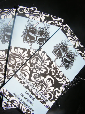
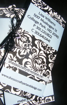
When you are ready to get really fancy you can create a new document and layout multiple cards using copy and paste but your placement needs to be precise. Use your rulers and remember to place each front and back in exactly the same place on each artboard, re sizing each artboard when finished to remove any dead or negative space. Your finished product will look something like the finished product below. If you are sending to a printer to print the rest it is best to convert all of your text to outlines to avoid text issues and save as an EPS and then distill it to a single PDF document. I hope this helps anyone who designs on how to get a proof printed at home with double sided printing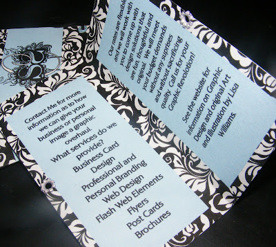

So I was needing to update my promotional materials and I thought this would be a good time to use a really cool technique to Create a mini brochure Business Card size.
Let's go thru the process.
Personally I'm an instant gratification type of girl and I like to be able to print my stuff myself and not wait until I've sent my docs off to the printer to see how it works, so I test drove some of the new features in Illustrator CS4 to Set up the card and print it.
In the newest version of Illustrator it is very easy to set up double sided printing because they give you the use of multiple artboards on your screen.
For this card you need to set up the document to have multiple Artboards and you do this from the New Document screen.
 Where it says number of Artboards change that to 2. In the width and height change that to 4 inches wide and 3.75 inches high. This will create two art boards that are double business card size. You can size these up a bit to fit your purposes.
Inside of Illustrator you will find two art boards side by side that are constrained to your specified size. The next step is to start on your design. Turn your rulers on and set up your guides for bleed and for the fold at 2 inches on both boards and begin laying out your design.
The front of your document should be on the left artboard with the front cover actually on the right and the back cover actually on the right. On the second Artboard the text for the left inside should be on the left and the right inside text will be of course on the right.
Complete your design and then go ahead and print it out using the illustrator print options.
You need to have some knowledge of how your printer handles double sided prints. For me it was easiest to print the cards one at a time and flip the paper each time to get the print on the back.
When you are ready to get really fancy you can create a new document and layout multiple cards using copy and paste but your placement needs to be precise. Use your rulers and remember to place each front and back in exactly the same place on each artboard, re sizing each artboard when finished to remove any dead or negative space. Your finished product will look something like the finished product below. If you are sending to a printer to print the rest it is best to convert all of your text to outlines to avoid text issues and save as an EPS and then distill it to a single PDF document. I hope this helps anyone who designs on how to get a proof printed at home with double sided printing